A major problem with Large Language Models is that they can’t explain the logic of their Black Box approach to diagnosis. This is a problem in real world applicability of LLMs because clinicians are reluctant to follow the advice that is not adequately explained, and when explanations are offered, the explanations tend towards confirmation bias. In contrast, clinicians are much more likely to follow advice that is explained. The same applies to intercommunication among clinicians – the ability to explain why a diagnosis was reached makes it easier to have productive evidence-based discussions.
Example to work through
Consider a 50-year-old woman with recent onset of diarrhea, weight loss, anemia and low serum albumin. A variety of diseases are in the differential diagnosis (Registered users can click the images below to jump into the software; some videos may be helpful in navigating from there).
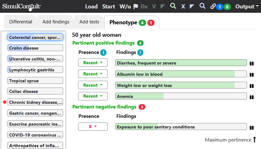
Clicking on one disease (here Colorectal cancer) and clicking the blue X on the top black navigation bar displays the Explain Diagnosis screen for the selected disease.
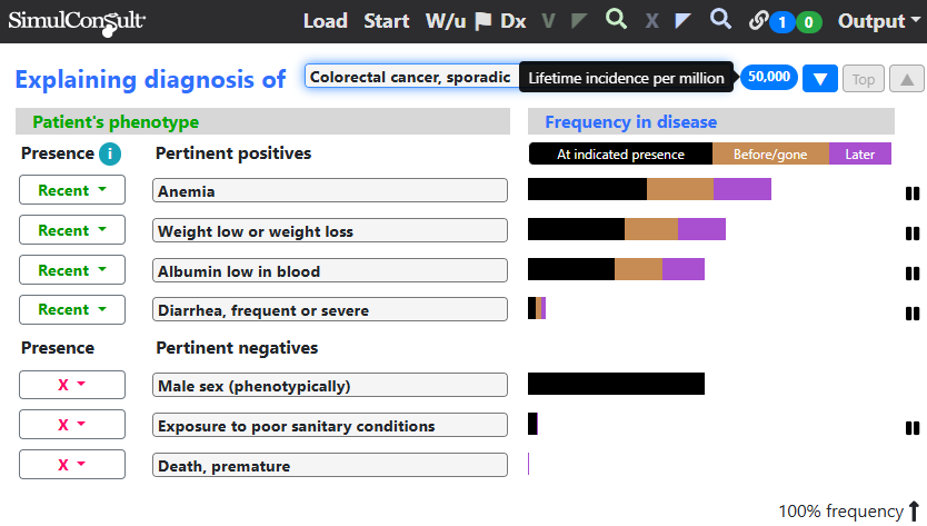
The total length of the bar, including all colors, is the total frequency of the finding in colorectal cancer. The black part of the bars is the frequency at the timing indicated for the finding in the current patient (here all are recent). A good fit is a lot of black for the pertinent positive findings and little black for the pertinent negative findings. The fit for colorectal cancer is good, except that diarrhea is uncommon, though diarrhea could of course be due to another problem. Note the blue oval with “50,000”, the lifetime incidence per million of colorectal cancer, which denotes that the condition is very common and thus worth considering even if it doesn’t account for all the findings.
Clicking the blue downward arrowhead button goes to the next lower disease in the differential diagnosis, Crohn disease.
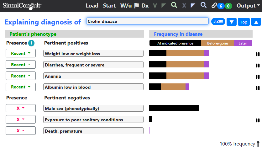
The fit for Crohn disease is better, but the lifetime incidence is much lower, which is why Crohn disease is lower in the differential diagnosis, despite the better fit.
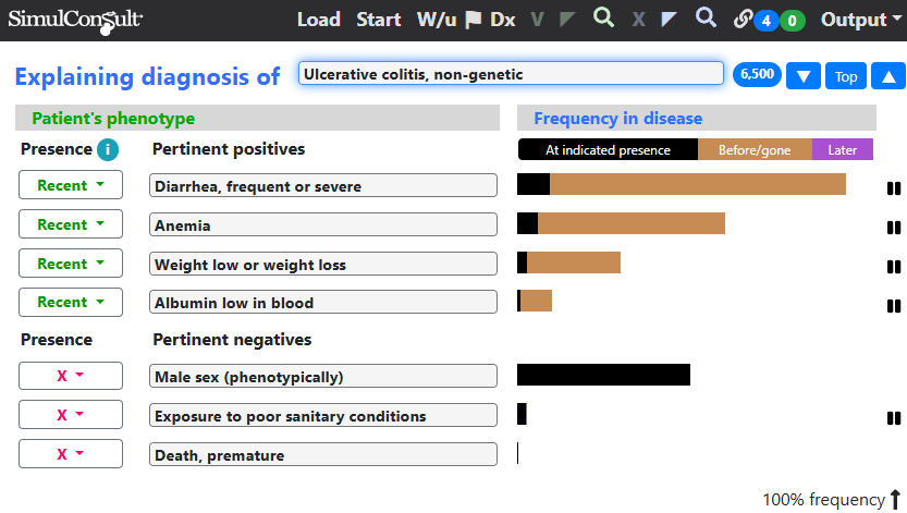
Clicking down to ulcerative colitis, a greater fraction of each frequency bar has earlier onset (orange color), giving a less good fit. In other patient cases, the finding could have later onset, indicated in purple, but not a significant factor in the case illustrated here.
One of the core principles known in medical informatics is that clinicians value explainability as much as they value the correct ranking of possible diagnoses.
This principle is particularly important in medical diagnosis because some information in the older medical literature is now known to be incorrect. Using the Explain Disease screen the clinician can verify or check information about the findings and diseases. Users who have database curation privileges can change any information that is no longer believed to be true, instantly in their copy and after editorial approval, in the data used by others as well.
The error that occurs by not carrying out such an analysis is that the clinician is out of the loop, not engaging in the evidence for or against each diagnosis. The displays shown here (or the equivalent calculations in ones head for an experienced clinician) are what a clinician needs to document the rationale for a differential diagnosis to communicate with colleagues.
This page is part of a series on the Elements of Diagnosis.
Copyright © 2025 SimulConsult